Kaya Containers

Kaya is a company present in 5 Latin American countries offering sales, maintenance, repair and many other services for shipping containers.

The challenge

The company was going through a period of strong communication fragmentation, in which its digital image could no longer consistently reflect the value and professionalism of the brand. Its online presence had several structural issues:

  • Website: the portal had technical and functional limits that undermined its effectiveness and the user experience.
  • Social media: a scattered approach with numerous Instagram accounts created over time, which communicated inconsistently or had been abandoned.
  • Visual identity: a logo tied to a communication phase that was already behind, perceived as out of step with the growth of the company.
The Strategic Approach

In an era dominated by artificial intelligence, we focused on authenticity to differentiate the brand. The strategy centred on human value and the truth of physical spaces:

  • Visual storytelling: a shift from stock images to original content (photos and videos) of the real team and offices.
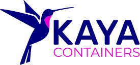
  • Brand evolution: restyling of the hummingbird, updating its shape, typography and palette for greater versatility.
  • Social reality: a constant narrative focused on the human side and the everyday transparency of Kaya.

Brand

A bridge between history and the future

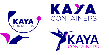
The rebranding of Kaya Containers was not a break with the past, but a conscious evolution. I decided to keep the hummingbird as the central symbol, to convey the energy and history of the company, redrawing it with a more modern line.

In the colour palette, blue remains the protagonist to convey the solidity and trust needed in the logistics sector, but I introduced magenta as an accent of growth, adding a touch of modernity and humanity that brings the brand closer to the customer.

Finally, I chose solid, geometric typefaces, essential to communicate structure, precision and operational reliability.

Previous logo

Options presented to the client

Final logo

The Digital Architecture:
Performance and Clarity

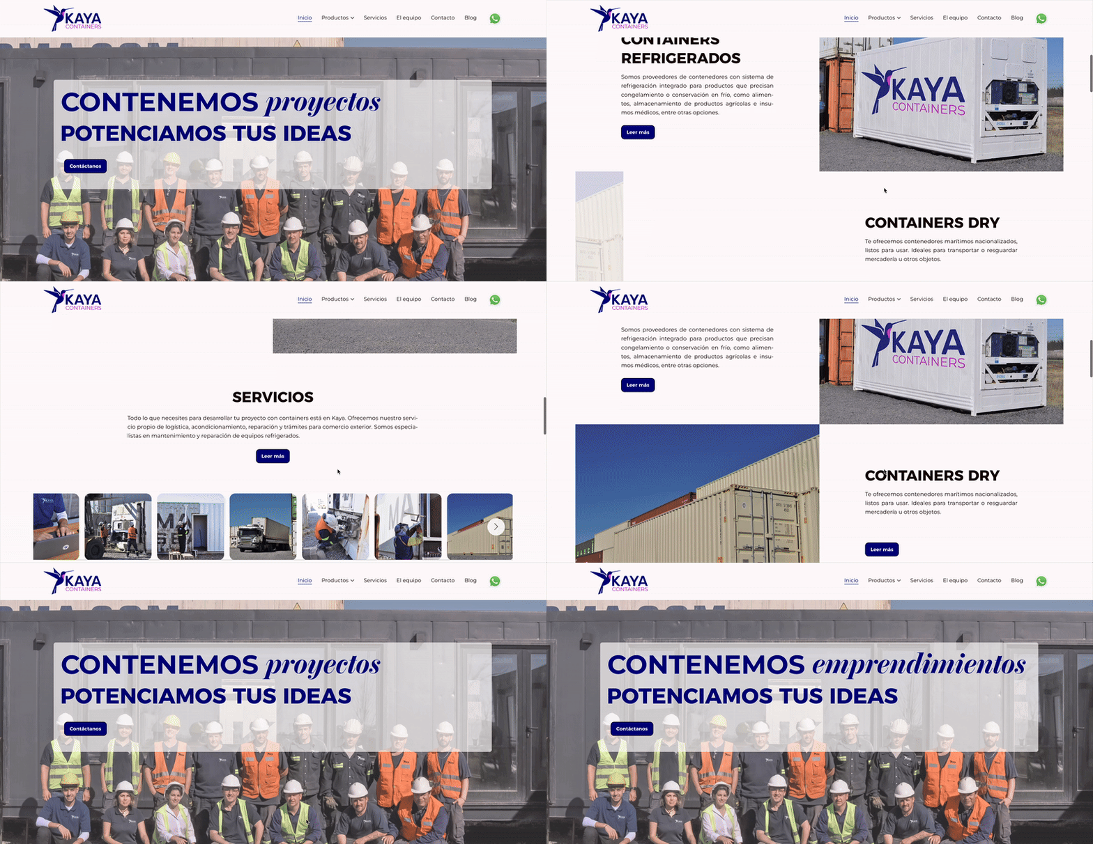
The new Kaya Containers website is not just a showcase, but an operational tool. I redesigned the entire user experience (UX) to make navigation smooth on every device, making sure the key information (such as services, logistics data and contacts) is accessible in a few clicks.

SEO optimisation and user experience were the priorities to ensure a competitive presence on search engines.

Learn more

Kaya Containers website

Social Presence:
Consistency and Dialogue

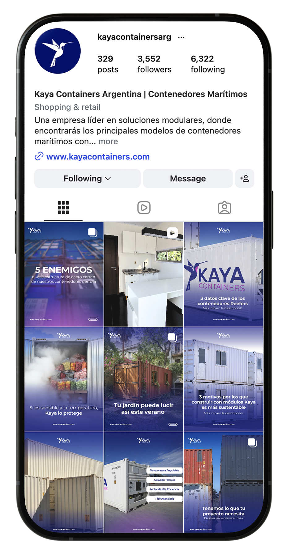
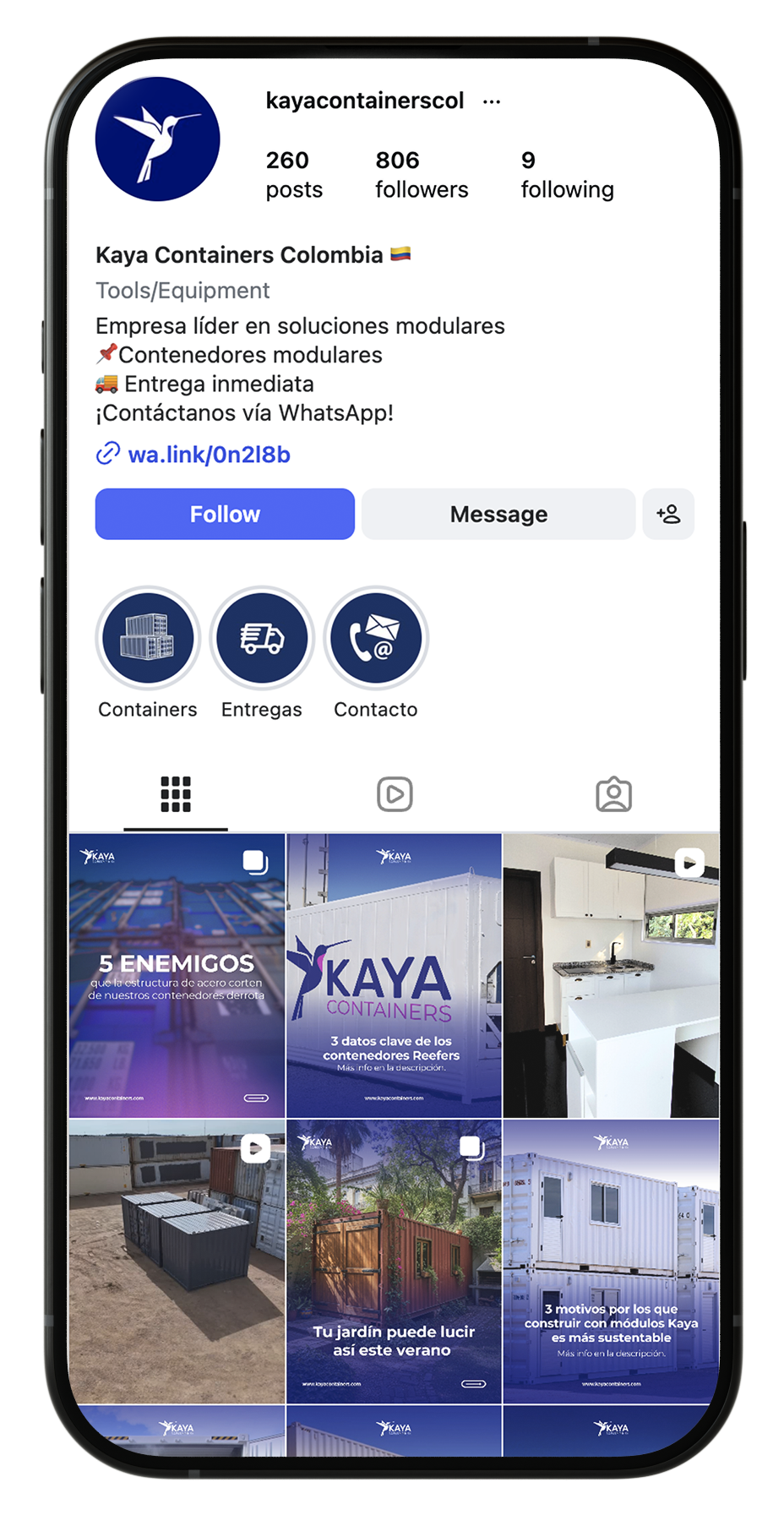
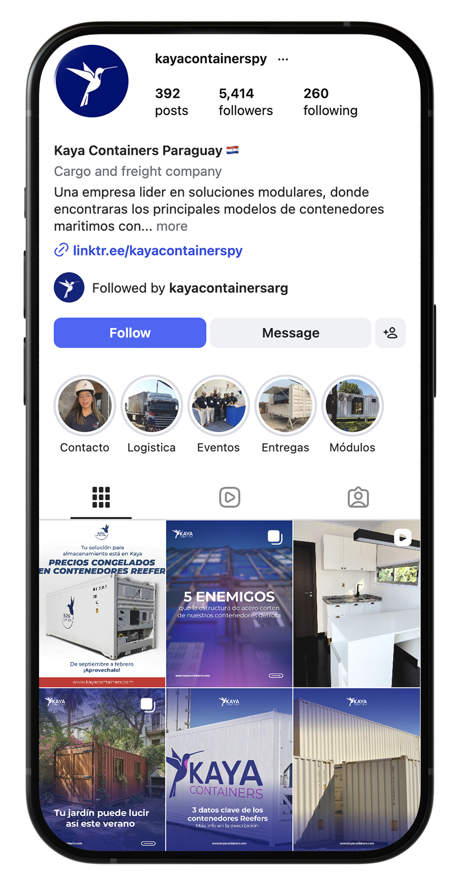
The visual strategy extends to social channels, where brand consistency is essential. I defined clear guidelines for LinkedIn and Instagram, using the new colour palette and chosen typography to create a visual language recognisable at first glance. The goal is to turn every post into a professional touchpoint that strengthens customer trust.

Instagram profile of Kaya Containers Argentina
Instagram profile of Kaya Containers Colombia
Instagram profile of Kaya Containers Paraguay
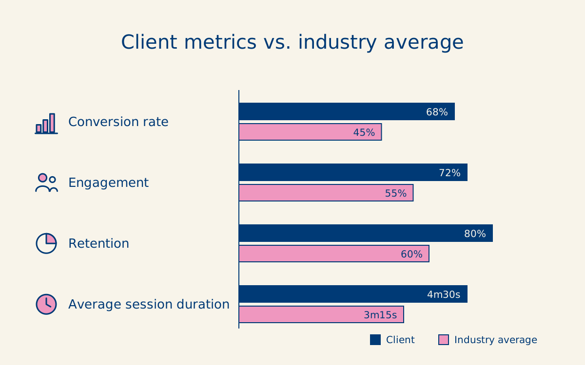
Client metrics vs. industry average: conversion 68% vs 45%, engagement 72% vs 55%, retention 80% vs 60%, average session duration 4m30s vs 3m15s

Funnel Optimisation and Global Performance

The launch of the new digital ecosystem brought a radical turnaround for Kaya Containers in just 9 months.

  • Global benchmark: the new website reached a volume of unique visitors more than 90% above the average of competitors in the logistics sector worldwide.
  • Exponential growth: we scaled the digital presence to over 56,000 sessions and 49,500 unique users, consolidating the markets of Argentina, Mexico and Uruguay.
  • Mobile-first UX: UI/UX choices validated by data: 84% of global traffic browses and interacts with the brand from mobile devices.
  • Brand awareness: the strength of the rebranding made Direct traffic the second source of visits (+11,000 users), showing that people actively search for the name "Kaya Containers".
Request a quote All case studies